class: center, middle, inverse, title-slide # Publication-ready plots with ggplot2 ## Advanced plotting in R 2021 ### Michael Matiu ### 2021/05/11 --- ## Scales - general .pull-left[ Scales in ggplot follow the convention: `scale_[aesthetic]_[name]()` For example: ```r scale_x_continuous() scale_x_discrete() scale_x_date() scale_color_continuous() scale_color_discrete() scale_fill_continuous() scale_fill_discrete() scale_shape() scale_size() ``` ] .pull-right[ They all share some main arguments: ```r name limits breaks labels ``` Legends (guides) and axes are automatically created based on scale function. ] --- ## Color scales - discrete .panelset[ .panel[.panel-name[default: hue] .pull-left[ Invoked with `scale_[color|fill]_discrete()`. With the `scales` package we can have a look at the colors. ```r library(scales) hue_pal()(4) ``` ``` ## [1] "#F8766D" "#7CAE00" "#00BFC4" "#C77CFF" ``` ```r show_col(hue_pal()(4)) ``` ] .pull-right[ 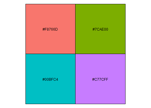<!-- --> ] ] .panel[.panel-name[brewer 1] .pull-left[ See https://colorbrewer2.org/ for more info Three types: sequential (default), diverging, qualitative Invoked with `scale_color_brewer()`. ```r brewer_pal()(4) ``` ``` ## [1] "#EFF3FF" "#BDD7E7" "#6BAED6" "#2171B5" ``` ```r show_col(brewer_pal()(4)) ``` ] .pull-right[ 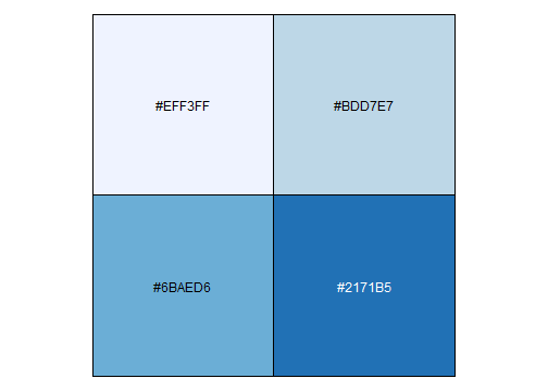<!-- --> ] ] .panel[.panel-name[brewer 2] .pull-left[ Usually you need something qualitative for discrete color scales. In a ggplot you would need to add `scale_color_brewer(palette = "Set1)`. ```r brewer_pal(palette = "Set1")(4) ``` ``` ## [1] "#E41A1C" "#377EB8" "#4DAF4A" "#984EA3" ``` ```r show_col(brewer_pal(palette = "Set1")(4)) ``` ] .pull-right[ 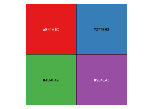<!-- --> ] ] .panel[.panel-name[viridis] .pull-left[ Normally used for continuous, but also possible discrete with `scale_color_viridis_d()`. ```r viridis_pal()(4) ``` ``` ## [1] "#440154FF" "#31688EFF" "#35B779FF" "#FDE725FF" ``` ```r show_col(viridis_pal()(4)) ``` ] .pull-right[ 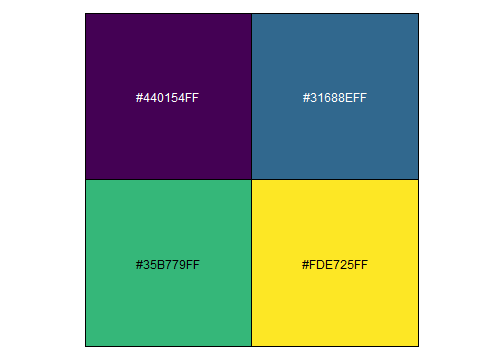<!-- --> ] ] ] --- ## Color scales - continuous .panelset[ .panel[.panel-name[distiller (brewer)] Invoked with `scale_[color|fill]_distiller()`. Choose a palette on https://colorbrewer2.org/ and specify with argument `palette = `. ] .panel[.panel-name[viridis] .pull-left[ Used with `scale_color_viridis_c()`. The `option = ` argument allows to choose between the different viridis scales (magma, inferno, cividis, ...). See the help page for more info. ```r show_col(viridis_pal(option = "A")(20)) ``` ] .pull-right[ 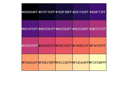<!-- --> ] ] .panel[.panel-name[scico] .pull-left[ The `scico` package offers nice scientific color maps (needs to be installed separately). See https://www.fabiocrameri.ch/colourmaps/ for more info. Used with `scale_color_scico()`. ```r library(scico) ``` ```r scico_palette_show() ``` ] .pull-right[ 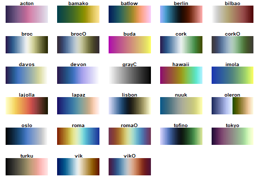<!-- --> ] ] .panel[.panel-name[gradient2] .pull-left[ Special useful scale for diverging patterns. The built-in `scale_color_gradient2()` offers to specify low, mid, and high colors, and most importantly, the `midpoint = 0`. Diverging scales work best for symmetric data, e.g. correlations from -1 to 1. ```r tibble(corr = runif(100, -0.4, 0.9)) %>% ggplot(aes(0, corr, color = corr))+ geom_point(size = 4)+ * scale_color_gradient2() ``` ] .pull-right[ 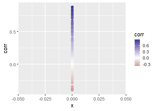<!-- --> ] ] .panel[.panel-name[symmetry for diverging] .pull-left[ brewer and scico also have diverging scales, but without the midpoint argument. To enforce symmetry in the color scale, e.g. if your values only span -0.4 to 0.9, you need to - set the limits in the color scale `limits = c(-1, 1)` - use `scales::rescaler_mid` for the `rescaler = ` argument ```r tibble(corr = runif(100, -0.4, 0.9)) %>% ggplot(aes(0, corr, color = corr))+ geom_point(size = 4)+ scale_color_distiller(type = "div", * rescaler = scales::rescale_mid) ``` ] .pull-right[ 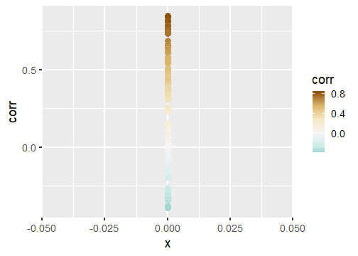<!-- --> ] ] ] --- ## Manual scales .panelset[ .panel[.panel-name[base] All discrete scales have a `scale_*_manual()` version, where you can specify the aesthetics manually using the `values = ` argument. For this you can use - hex codes for colors (colorbrewer or from scales package) - look at `?pch` for point symbols - for linetype you can use predefined words (`"dashed"`, `"solid"`, `"dotted"`, ...) or hex-style identifiers (0-9, a-f) to define a linetype, e.g. `"F2"` or `"4282"`. ] .panel[.panel-name[tips] .pull-left[ When specifying manual scales, the length needs to exactly match the number of levels. OR You can pre-specify the "mapping" by creating a named vector. ```r cols_man <- setNames( c("red", "black", "white", "blue"), # color values LETTERS[1:4] # names ) cols_man ``` ``` ## A B C D ## "red" "black" "white" "blue" ``` ```r tibble(grp = c("A", "D")) %>% ggplot(aes(grp, grp, fill = grp))+ geom_tile()+ * scale_fill_manual(values = cols_man) ``` ] .pull-right[ <!-- --> ] ] ] --- ## Theme The standard theme is `theme_grey()`. Other options for full themes are `theme_bw()`, `theme_classic()`, `theme_void()`. To change the overall (base) size of the plot just add `theme_grey(18)`, default is 11. Besides you can manually style almost every element with the `theme()` function. Where you need the theme elements: `element_blank()` to remove something; `element_line()`, `element_rect()`, and `element_text()` to style the elements. More info: https://ggplot2.tidyverse.org/reference/theme.html https://ggplot2-book.org/polishing.html Other pre-made complete themes: https://yutannihilation.github.io/allYourFigureAreBelongToUs/ggthemes/ --- ## Arranging multiple plots .panelset[ .panel[.panel-name[patchwork 1] .pull-left[ Patchwork is a simple and intuitive framework. https://github.com/thomasp85/patchwork You can just add plots together: ```r p1 <- ggplot(mtcars) + geom_point(aes(mpg, disp)) p2 <- ggplot(mtcars) + geom_boxplot(aes(gear, disp, group = gear)) *p1 + p2 ``` ] .pull-right[ <img src="https://raw.githubusercontent.com/thomasp85/patchwork/master/man/figures/README-example-1.png"> ] ] .panel[.panel-name[patchwork 2] .pull-left[ or use `|` to put plots side-by-side and `/` to position below each other. ```r p3 <- ggplot(mtcars) + geom_smooth(aes(disp, qsec)) p4 <- ggplot(mtcars) + geom_bar(aes(carb)) *(p1 | p2 | p3) / * p4 ``` ] .pull-right[ <img src="https://raw.githubusercontent.com/thomasp85/patchwork/master/man/figures/README-unnamed-chunk-2-1.png"> ] ] .panel[.panel-name[cowplot 1] .pull-left[ The cowplot package is an alternative. https://wilkelab.org/cowplot/articles/plot_grid.html (IMHO, it works better for labeling plots `->` publications) ```r p1 <- ggplot(mtcars, aes(disp, mpg)) + geom_point() p2 <- ggplot(mtcars, aes(qsec, mpg)) + geom_point() *plot_grid(p1, p2, labels = "AUTO", rel_widths = c(1, 2)) ``` ] .pull-right[ <img src="https://wilkelab.org/cowplot/articles/plot_grid_files/figure-html/unnamed-chunk-11-1.png"> ] ] .panel[.panel-name[cowplot 2] .pull-left[ ... and it works great with faceted plots. (Also mixing different plotting frameworks, like base plot.) ```r *bottom_row <- plot_grid(p1, p2, labels = c('B', 'C'), label_size = 12) p3 <- ggplot(mtcars, aes(x = qsec, y = disp)) + geom_point() + facet_wrap(~gear) *plot_grid(p3, bottom_row, labels = c('A', ''), label_size = 12, ncol = 1) ``` ] .pull-right[ <img width=80% height=80% src="https://wilkelab.org/cowplot/articles/plot_grid_files/figure-html/unnamed-chunk-12-1.png"> ] ] ] --- ## Annotating .pull-left[ For simple annotations you can use the `annotate()` layer. You can use any geom you like (be sure to specify the needed aesthetics). ```r tibble(x = 1:10, y = 1:10) %>% ggplot(aes(x, y))+ geom_tile()+ annotate("text", x = 1, y = 6, label = "this is a stair", size = 5)+ annotate("segment", x = 1, xend = 1, y = 5.5, yend = 1.8, arrow = arrow(), size = 2)+ annotate("label", x = 5, y = 7, label = "do not walk on it", size = 5) ``` ] .pull-right[ <!-- --> ] --- ## Mixing data sets with facets .panelset[ .panel[.panel-name[prep data] ```r n_grp <- 4 n_points <- 20 tbl_wrap <- tibble( grp = rep(LETTERS[1:n_grp], each = n_points), xx = rep(1:n_grp, each = n_points) + rnorm(n_grp*n_points), yy = rep(n_grp:1, each = n_points) + rnorm(n_grp*n_points) ) tbl_wrap_mean <- tbl_wrap %>% summarise(xx_mean = mean(xx), yy_mean = mean(yy)) tbl_wrap_mean_grp <- tbl_wrap %>% group_by(grp) %>% summarise(xx_mean = mean(xx), yy_mean = mean(yy)) ``` ] .panel[.panel-name[plot] .pull-left[ ```r ggplot(tbl_wrap, aes(xx, yy))+ geom_point()+ geom_point(data = tbl_wrap_mean, aes(xx_mean, yy_mean, colour = "overall mean"), size = 5)+ geom_point(data = tbl_wrap_mean_grp, aes(xx_mean, yy_mean, colour = "group mean"), size = 5)+ facet_wrap(~grp) ``` ] .pull-right[ <!-- --> ] ] ] --- ## Polishing .panelset[ .panel[.panel-name[Titles] .pull-left[ ```r tibble(x = 1:10, y = 1:10) %>% ggplot(aes(x, y, fill = y))+ geom_tile()+ scale_fill_continuous("Legend name")+ xlab("This is X")+ ylab("This is Y")+ ggtitle("Not really useful title", "The subtitle is not better. But optional.") ``` ] .pull-right[ <!-- --> ] ] .panel[.panel-name[Math] Using it in ggplot is often challenging (I always forget how to do it, and need to google it). The plotmath (see `?plotmath`) language is tedious. And it differs if you use it in axis titles, axis labels, geom_text, facets, or legend. See e.g. https://adventuresindata.netlify.app/post/2019-01-27-plotmath-in-ggplot2/ ] .panel[.panel-name[Labels] .pull-left[ The labels (legend, ...) are given by the data values. So change them directly in the data. It's made easier with the functions in the `forcats` package, like `fct_recode()`. ```r tibble(x = 1:5, y = 1:5, grp = LETTERS[1:5]) %>% mutate(grp_rename = fct_recode( grp, "was A, now Z" = "A", # new = old "was E, now T" = "E") ) %>% ggplot(aes(x, y, fill = grp_rename))+ geom_tile() ``` ] .pull-right[ 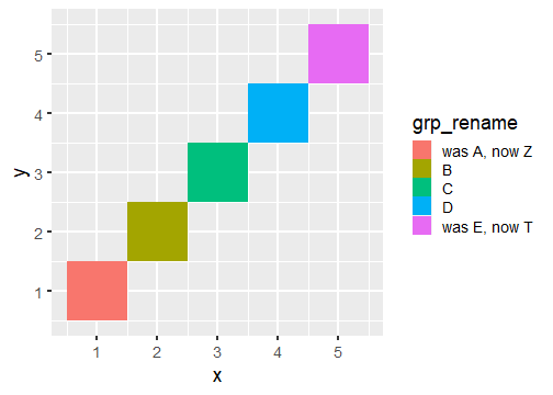<!-- --> ] ] .panel[.panel-name[Ordering] .pull-left[ By default, when factors are created they are ordered alphabetically. But often, it's not the best ordering you can have. For better visual perception, better to have custom ordering. Again, life is easier with the `forcats` package, with `fct_reorder()`. Also look at the other `fct_*` functions, e.g. `fct_rev()` for simple reversing. ```r mtcars %>% as_tibble(rownames = "car") %>% * mutate(car_fct = fct_reorder(car, wt)) %>% ggplot(aes(wt, car_fct))+ geom_point() ``` ] .pull-right[ 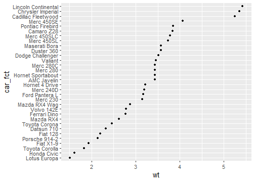<!-- --> ] ] ] --- ## Your turn (again)! .pull-left[ #### A) Not recommended: Structured exercises Go to the folder `02_Ggplot/exercises/` and start hacking! Solutions will be provided after the end of the day. #### B) Better: Start making a publication-ready figure If you brought own data: Use it! Otherwise, feel free to use the provided data in `00_Data/`. Consult the `Readme.md` inside for more info. ] .pull-right[ #### Finally Last 15 min: We can go through your creations. Be proud of work in progress. No need for perfection. #### Best: Learn from each other. ]